Tuesday 12 April 2011

Another attempt at LIM Sentiment Focus Challenge


Having posted that I had some doubts about the three cards that I featured in my last post, I received mixed comments and some interesting feedback, which certainly gave me some food for thought. I've taken another stab at the Less is More Challenge to make a one layer card with the sentiment as the focus, and this is the result:


Once again I was able to give a first airing to some stamps that I had never used before. The background is a stamp from Elusive Images which is stamped in Brilliance Pearlescent Lavender. Sadly the shimmer doesn't show up well in the photo. The sentiment is from a  clear set by Cloud 9. Just a touch of bling finishes the card off. I did think of using pearls, but didn't have the correct shade, or tiny flowers punched from vellum, but they didn't look right. So there it is, very simple.

My initial reaction to the feedback on the previous cards was to mull over the advice offered and try to do better next time. However, I just couldn't resist reworking them to try to take on board the points that were made. Here follow the results, which you may or may not think look better.

For this one I replaced the Kids Quote sentiment with a quote that I found on the internet and typed into a text box in Word. I used what I think looks like a more sophisticated font to fit better with the style of the frame.

 Here again, I've replaced the sentiment - this time with another stamped sentiment from the Cloud 9 set. I've used a blue ink instead of black, but am still wondering if it's a little too dark for the background image. I'm tempted to try it again with the text stamped in a softer grey shade. 
Finally, I reworked the ribbon on this one and added some black gems. Someone did ask in one of the comments how I managed to emboss the front of the card without the lines of the folder showing. Well the truth is that I didn't manage that with this card, and the ribbon is there primarily to hide that line. If I were starting this card again from scratch, I would emboss it more carefully and make sure that the edges of the folder did not pass through the pressure rollers in my Cuttlebug, as I did with the cupcake card above. It's hard for me to describe exactly what I mean, but there are some good and useful resources on the internet if you do a search for Cuttlebug tips.
Once again, many thanks to all who took the time to view and review my cards. All of your comments are really appreciated.

Sunday 10 April 2011

LIM Challenge - Sentiment Focus

I really love the Less is More Challenge for several reasons, including:
It's all about Clean and Simple cards, which are my favourite style.
It's inspiring me to use stamps and techniques that I've never used before and to try out new ideas.
Best of all, it's creating a lovely supportive community of LIMettes, many of whom take the time to visit each other's blogs and leave comments. I'd like to thank all those of you who visited this blog last week and left encouraging comments. I really do appreciate it.

Anyway, this week's challenge is to make the sentiment the focus of your card, and I leapt into this with great gusto, as I have several sets of sentiment stamps that have yet to see a whiff of an inkpad. So much gusto in fact that I've ended up making three cards and I can't decide on one to submit for the challenge, so I'm going to list all three. To be honest, I've slept on these and now am not quite so sure about any of them, so if you do feel like leaving a comment, I would appreciate some constructive criticism. So, taking a deep breath (and once again apologising for my poor photography), here goes with attempt number one:

The sentiment is from a really cute Inkadinkadoo set of Kids Quotes, which fits neatly into the frame created by the Cuttlebug Embossing Folder. To give a little taste of chocolate, I stamped the small cupcake from an Elusive Images set and coloured it with my Prismacolor pencils.

For card number two, I used Tim Holtz stamps and embossed with a Nestability die:
I wanted to keep the background image very subtle so used a pale chalk ink for that one, which sadly doesn't show up very well in the photo. I'm not entirely sure that the image fits in very well with the sentiment, which suggests something rather more chaotic to me, but I didn't have anything suitable that would fit in with the CAS theme.

I've used another Tim Holtz sentiment for the third card:
This one would also fit in with last week's theme of A touch of Red. I used a different embossing folder for this one and I picked out the heart with a glaze pen, so it's glossy in real life. I'm not sure about the ribbon and bow on this one. I think it may be a little too dominant.
I'd be really interested to hear what anyone else thinks, but even if you don't leave a comment, thanks for looking.

Monday 4 April 2011

A Touch of Red


Finally spurred into a return to blogging by the fantastic new CAS challenge blog at Less is More, here is my entry for this week's challenge, A touch of Red. I also made a second, similar card:
The image stamp is by Rubber Romance, I stamped in Versafine then clear embossed to give a sharper contrast and set the ink. The sentiments are by Hero Arts. Sorry the photos aren't brilliant, but I'm out of practice. I hope you like the cards.

Sunday 6 June 2010

Under the Sea


This is the card that I made for OH´s birthday this year, because since his last birthday he has become a PADI qualified diver. It also gave me the opportunity to break out this lovely stamp set from Elusive Images.
I was helped enormously by having the watery background, which had been made by my sister during a session when we were both playing with Starburst Stains. I had always wanted to create the large seahorse with Fantasy Film, and I used a dark peacock blue film that I bought ages ago at a show. However, I also wanted to use the shell and starfish stamps, so that gave me the challenge of how to create the sea bed. Luckily, I found a paper in the Artylicious Echoes of Italy set that looks like sand, and I stamped some extra texture onto the paper using a stamp called (I think) Field of Sky by Judikins. 
I stamped all of the shells and starfish onto printable inkjet labels, and coloured them with Promarkers. The I cut them out and stuck them to the background. I stamped a couple of smaller seahorses and weeds directly onto the background. After adding the Fantasy Film seahorse, I attached a piece of acetate over the whole picture using brads. As a final touch, I stuck some Zoomz to the top layer, to look like bubbles. 
Because of the acetate, I wasn´t able to avoid the reflection on the photograph, but I hope you can get the overall impression.
Thanks for looking.

Monday 24 May 2010

Back to the threes

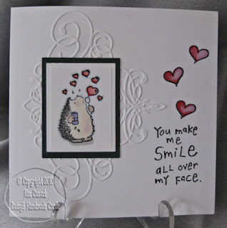
After a brief diversion into other topics, it's back to the theme of threes. This time, I have used a stamp from a Penny Black transparent set and inspired by the hearts, followed a romantic theme for all three. I also took the opportunity to practise my colouring with Promarkers.


For the first card, I used a panel of wrapping paper. It's a shame that you don't get feely-vision, because the red hearts are actually flocked, so it's a very tactile card. Simply embellished with a cuttlebug border folder, which I chalked very lightly to emphasise the text.


For the second card, I used another Cuttlebug embossing folder, a small heart from the same Penny Black set and a lovely text phrase stamp from a set of children's quotations by Inkadinkadoo.

Finally, this is my first attempt at an easel card. The hearts are all from a themed plate by Elusive Images, and some lovely backing paper by Craft House (I think). I coloured the heart brads with a Promarker and used a foiled sentiment by Papermania.

Thanks for looking,

Wednesday 10 February 2010

A Grungepaper Rose for my Valentine

It's that time of year again, when I rack my brains for an idea for a Valentine's card for my dear OH. This time, I thought it was an opportunity to have a go at making a grungepaper rose, as I have admired the many examples that I've seen in magazines and on blogs recently. Here is the result:

I made the rose by stamping with one of the flowers from the Elusive Images Harlequin Daisy set, and coloured it with Fired Brick Distress Ink. The other images are from the Harlequin Rose set by Elusive Images, stamped in Memento Ink in Rhubarb Stalk - a lovely rich red. I coloured the rose with my Sakura Stardust Pens for a bit of sparkle, and there's a bit more bling from the gems on the label. Finally added some hearts punched out with the fabulous Martha Stewart Lattice Heart punch. The backing papers are slightly shimmery and are from a set by Crafts House.
I hope you like it.

Sunday 7 February 2010

Playing with Promarkers

OK, so the doing things in threes didn't last very long. I actually do have 2 of 3 of the net set ready but have stalled on number 3. The main reason for that is that I got sidetracked last week - I went to a craft show and bought some more Promarkers, so I felt the need to practise with them in an attempt to improve my colouring techniques.

However, in the spirit of using up more of my thus far unused stamps, I have been using them with a couple of sets of cute Penny Black stamps that I bought longer ago than I care to admit.

Here are the results so far:


The stamp is from the Purrfect Day transparent set by Penny Black, coloured with Promarkers and mounted onto backing papers from Basic Grey and Hot of the Press., which have been punched with a Martha Stewart border punch. Finishing touches are a ribbon bow in pale lilac and some dots of Pearlidoodles.

I love this cute cat. Coloured again with Promarkers and mounted onto shapes cut with Nestabilities. The backing plate has been embossed with the Birds and Swirls folder. Just a simple bow on a curly clip to embellish.
It's that cat again, this time mounted on to my first attempt at a teardrop card. The backing paper is from a huge Papermania pad that I bought ages ago, and I've used the same paper on the other sides of the card, which is a trifold.

Well I haven't made three cards from the same stamp, but from the same set of stamps, so I guess that counts as doing things in threes.

Thanks for looking.